I mean, what’s going with the “Switch model“ selector?
This is what it looked like a couple of updates ago:

After that an unnecessary submenu was added:

And now we have that:
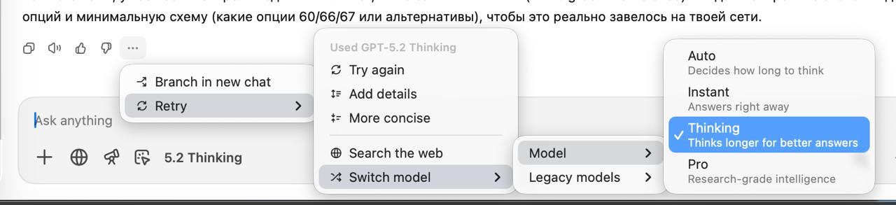
Seriously? What’s next?
And why don’t the links open?
What’s going on with the “New chat“ button? Why does this button move to the right after closing the sidebar?

