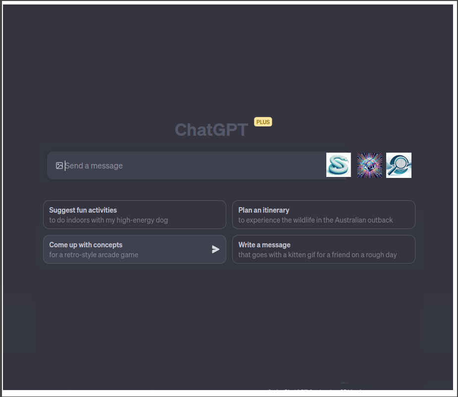
Enhance the visual hierarchy and distinction between primary actions and secondary information. For instance:
- Make the primary action buttons (write code, create images, search web) more prominent, perhaps with a brighter color or a subtle shadow.
- The icons (S, fireworks, and 9) on the right side could use a label or tooltip to explain their purpose or function, improving user understanding.
- Increase the contrast between active areas (like buttons) and the background to make it more user-friendly and accessible for all users, especially those with visual impairments.