Recently I am seeing suggestions in ChatGPT. These may be helpful to some people but others may find them distracting. I am trying to keep the UI as clean as possible to focus on my work.
I have to agree with this. They’re cluttering up the UI and don’t usually have any relevance to what I’m trying to do. Would be nice to have the option to disable.
It is this whole silly element that I colored purple that is the real pain.
Blocking the selection of text, coloring the text with a gradient, even blocking the scroll bar.
It is the container for not just the suggestions (which aren’t a problem if you have big enough screen they don’t also block plugin selections), but also for the button, still over the text even though I’ve got 300px of white space on the right where its buttons can be moved.
This is a perfect solution. Still, I’d like to share in venting as every new ChatGPT feature has come with a toggle. Except for this one. The fact that even 0.0005% of users experience issues with it should be enough to justify a toggle option for the suggestions as well.
Being brutally honest they are next to useless. Compared to all the other features I would rank the suggestions at the very bottom.
Other than not being useful, the examples block the plugins navigation in the UI rendering it impossible to use. I’m experiencing this issue in safari in one of the most common iPhones. It’s pretty fascinating how this feature could be rolled out in the first place.
That’s it. Im fed up with the fkin annoying prompt suggestions. I structure a prompt and switch windows on my andoird phone and things move around and destroy my work. Add the fkin option. You’ve wasted more time than you’ve helped me at this point.
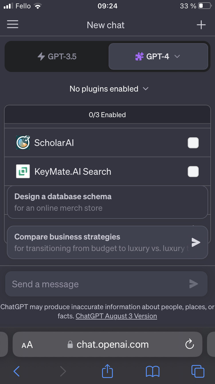
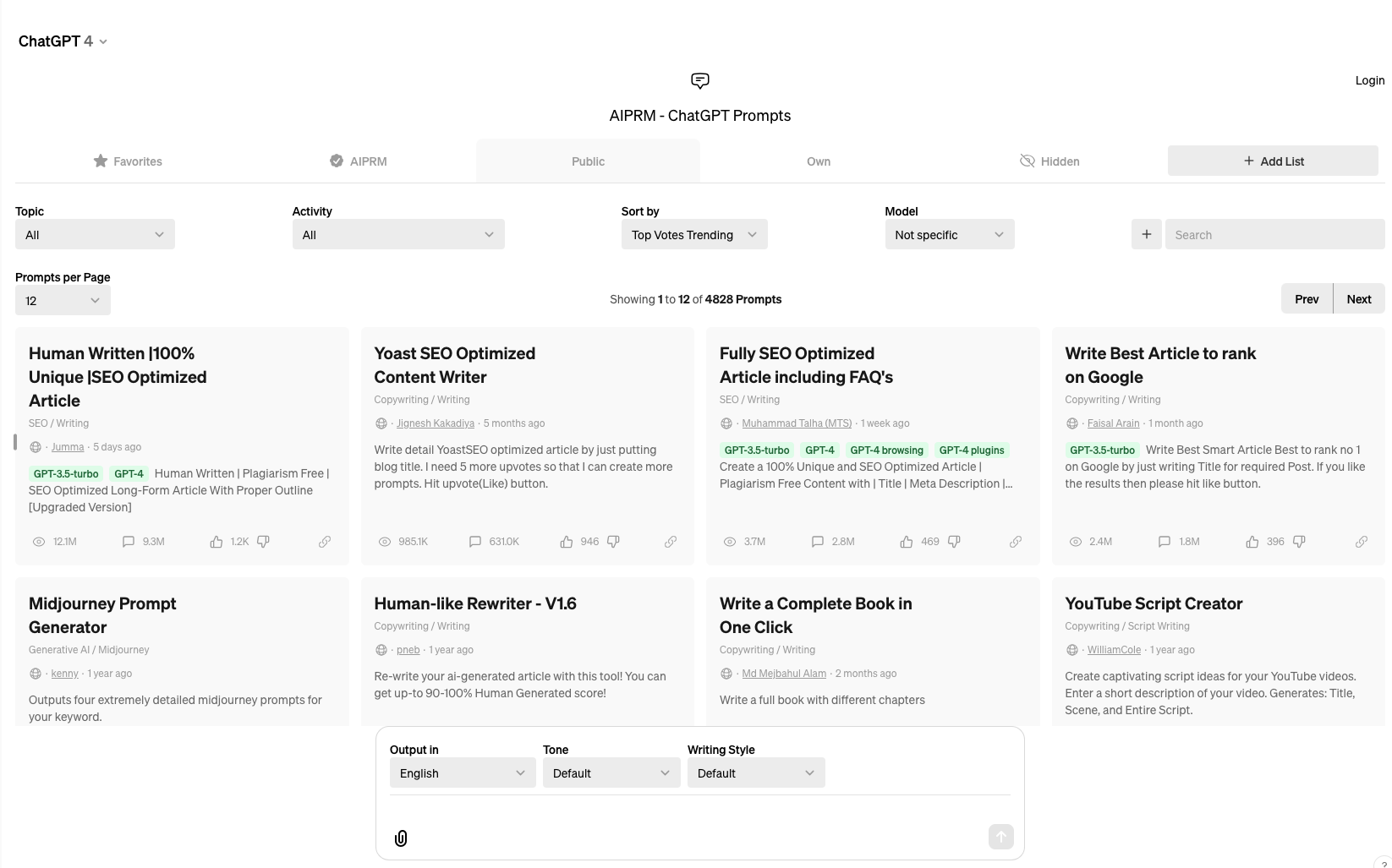
I’m trying to integrate plugins on ChatGPT 4, which is typically beneath the toggle buttons for GPT 3.5 and GPT 4.0
However, when I login I see a completely different interface for chatgpt filled with AIPRM Prompts, even after I have disabled the prompts and logged out
YES! they need to make this go away, ASAP. It is absurd to have an AI generate a potential prompt to ASK OF ITSELF! I do not care how likely I may have been to ask something, IT IS NOT AIs JOB TO TELL ME HOW TO INTERACT WITH IT!
These artificial nudges break immersion and make it difficult to stay on the platform. The obvious answers of turning off suggestions, turning off follow up mode, and giving a prompt don’t work.